2025-11-01 / Bairui SU
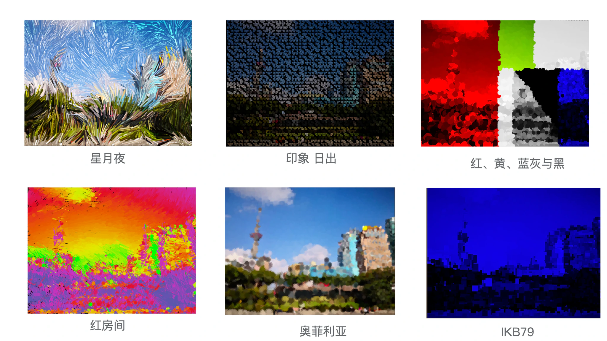
I've always been interested in artistic image processing, such as Jason Labbe's Portrait Painter. I love exploring color transformations with original images. I'm also a big fan of Mike Bostock's Visualizing Algorithms, where it's amazing to get pretty patterns that capture the core essence of each algorithm.
These works made me wonder: can we apply such beautiful patterns to images? To explore this idea, I created HAP, an online platform that filters images using algorithm visualizations powered by WebGL. The core concept is that color encoding is not only determined by the processing data structures—it also takes into account the original pixel color at each position.
This approach offers an abstract way to visualize algorithms by applying their patterns to images, providing a high-level view of each algorithm's key features. It can also be used for photo colorization and texture mapping.
How It Works
I implemented a WebGL-powered filter API that blends colors into polygons or points areas of the source image, which can also be mapped onto a sphere as well. Areas are computed during the visualization process of each algorithm. The following algorithms are supported:
- Sampling: Uniform, Normal, and Poisson Disc.
- Searching: Binary Search and Golden Search.
- Sorting: Bubble Sort, Insertion Sort, Quick Sort and Selection Sort.
- Graph: BFS, DFS and Prim's Algorithm.
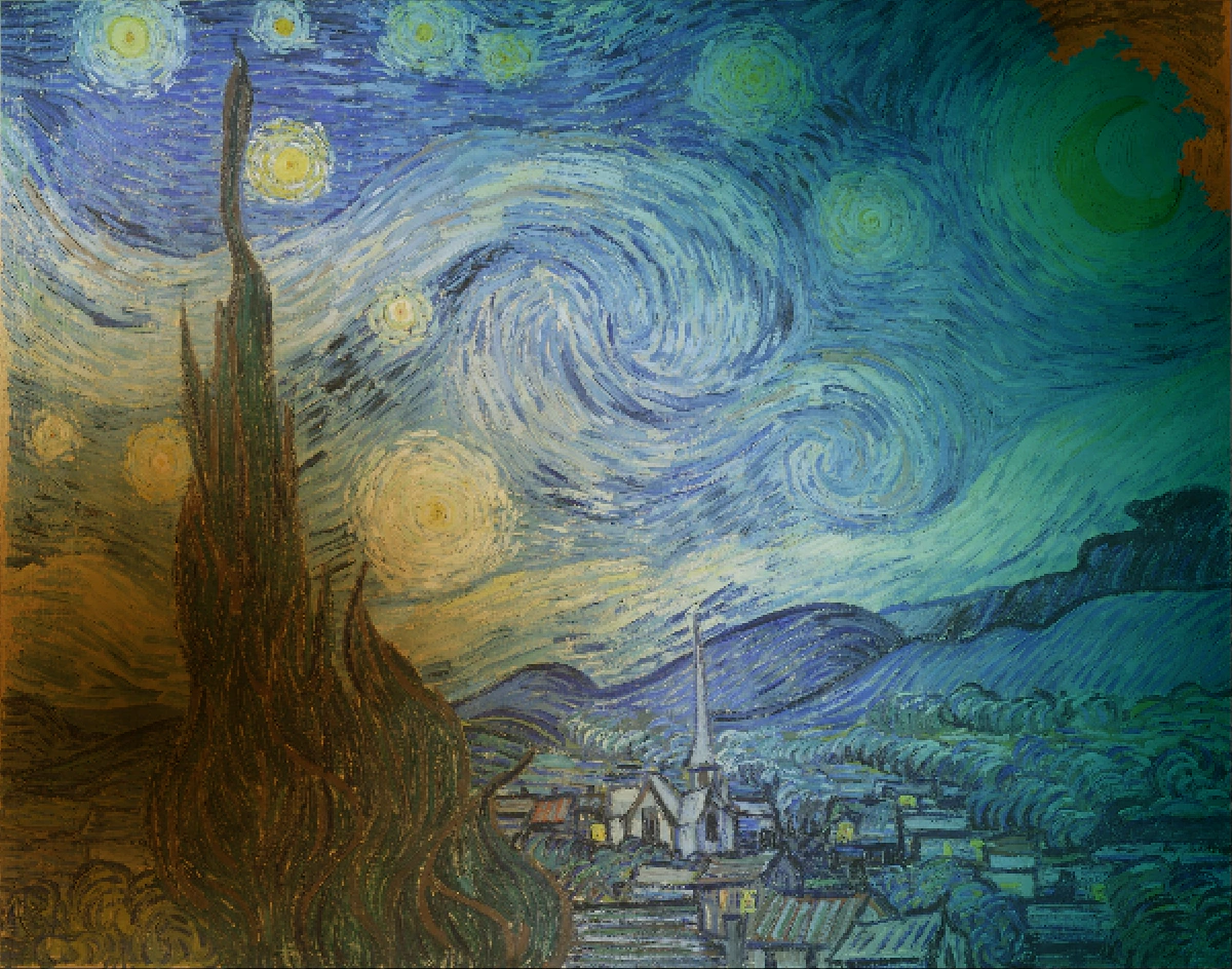
I used Van Gogh's Starry Night as the default image with a rainbow color scheme from d3-scale-chromatic. Users can upload their own images and choose from various algorithms and color schemes to apply to them. Here are some examples:
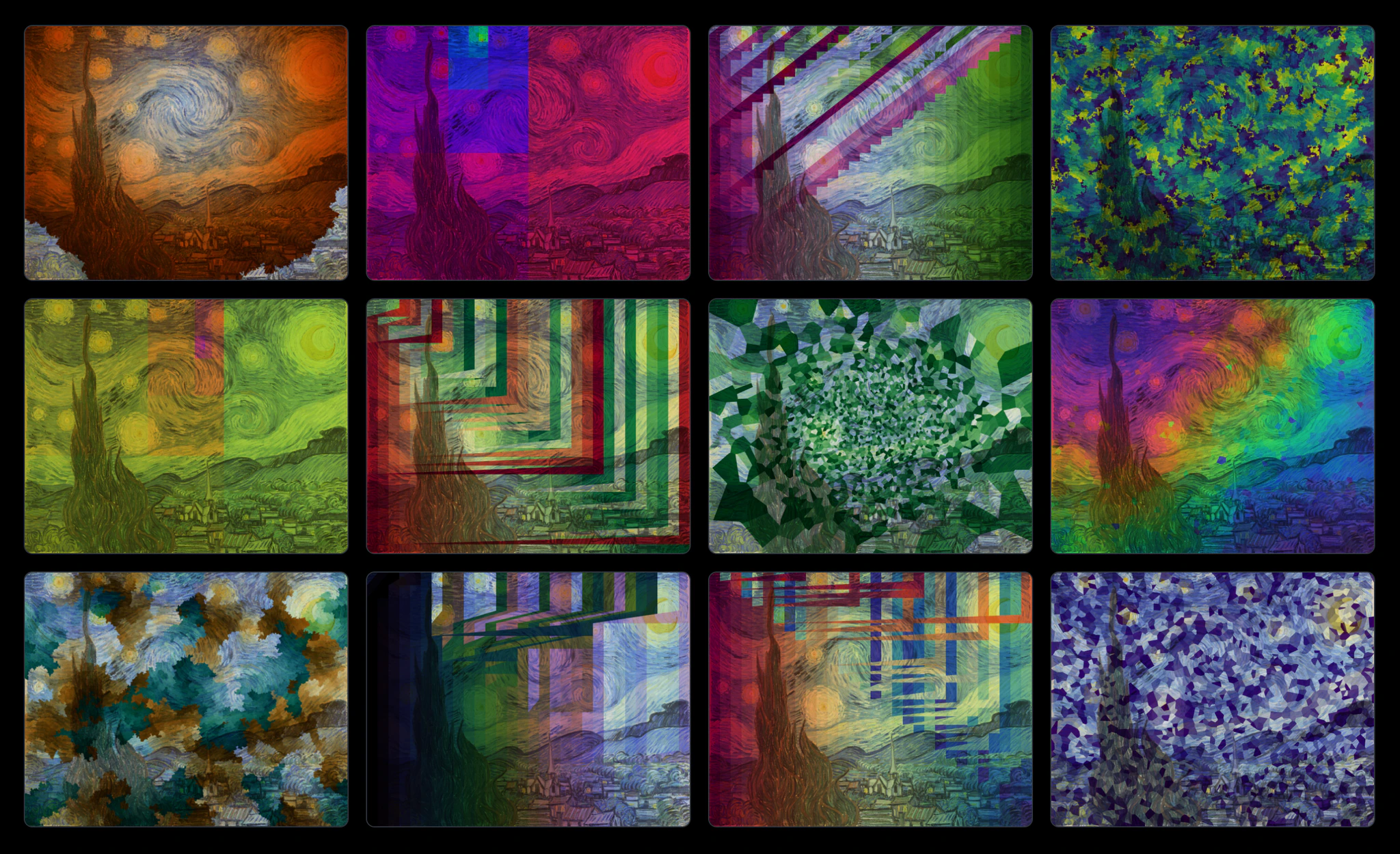
Sampling
I started with sampling algorithms first, because they're important to visualization. It can be seen as a painter applying discrete strokes to the canvas. The strokes for the sampling visualizations would be polygons computed by voronoi diagrams, which are computed by the following steps:
- Generate a set of random points in the image by the specific sampling algorithm.
- Encode the color of the points based on the occurrences added to the canvas.
- Compute the Voronoi diagram of the points.
- Color the polygons by mixing the original pixel color and the encoded color.
Uniform Random
I visualized the Uniform Random sampling algorithm with d3-random and d3-voronoi at first. From the video, you can tell more and more dots are added to the canvas by the increment of the number of polygons. For me, it doesn't look good. The colors are randomly distributed and the size of polygons vary a lot. This is key feature of uniform random: it is both severe under- and over-sampling, leading to a lot of small polygons and a few large polygons. However, it's a good start point to make sure the idea works.
Normal Random
To add more easily observed patterns to the generated polygons, I then tried
Normal Random sampling algorithm. I'm more satisfied
with the result. The sizes of polygons are now related to the distance to the center of the image: the further
away from the center, the larger the polygon. This adds a little bit of depth perception to the image, which is
a nice touch. It also shows the key feature of normal random:
it is more likely to generate points around the mean value which is the center of the image here.
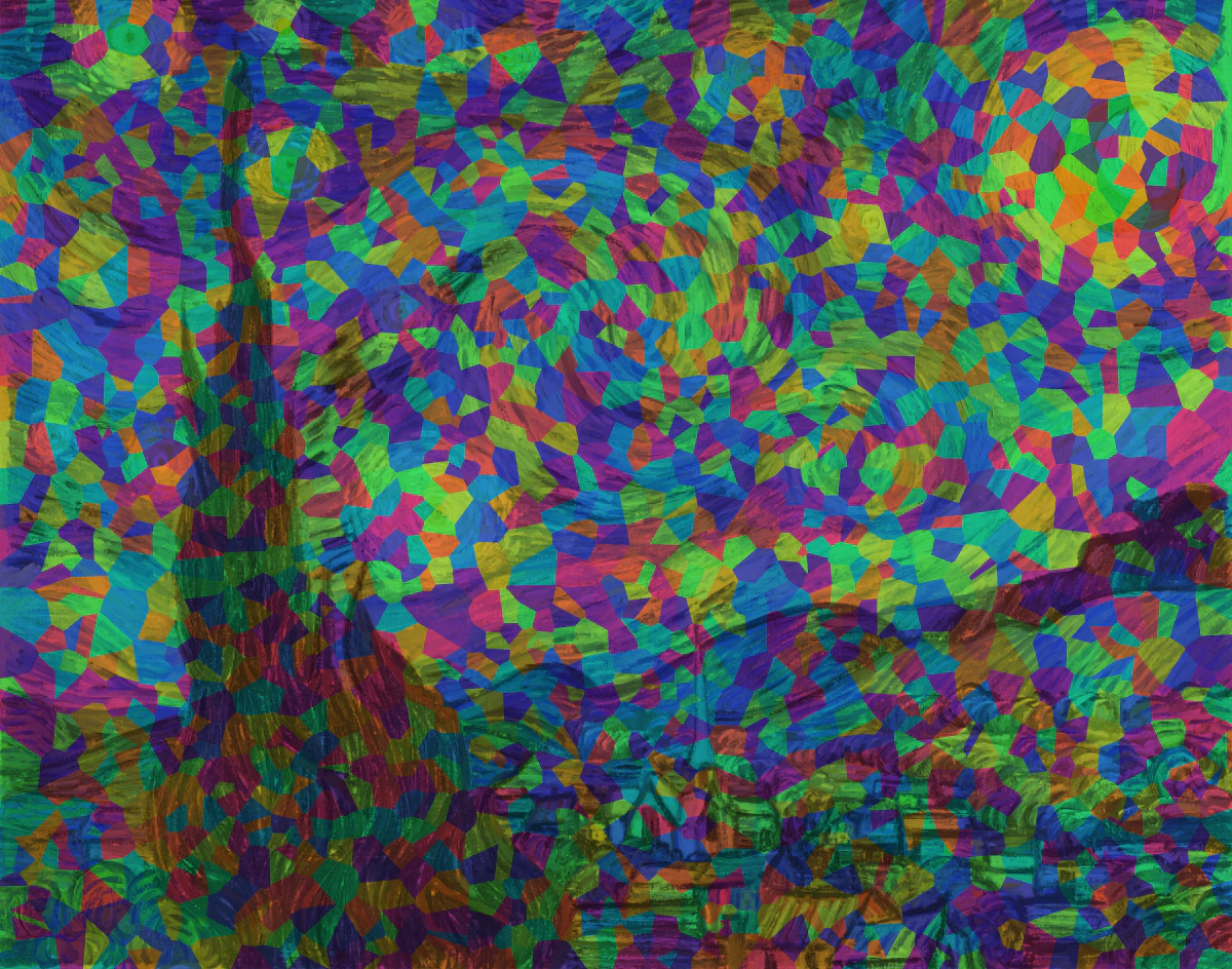
Poisson Disc Random
At last, I tried Poisson Disc sampling algorithm. The result is amazing! The colors are continuous and the size of polygons are more consistent. The whole coloring process is like the ink spreads across the entire canvas. It also shows the two key features of Poisson Disc:
- It is more likely to sample new points around the existing points.
- A minimum-distance constraint is enforced to ensure the points are well-distributed.
Sampling Comparison
Here is the comparison of the three sampling algorithms. The Poisson Disc Random is the most satisfying one in terms of the color and the size of polygons with the specific image and color scheme.
 Uniform Random
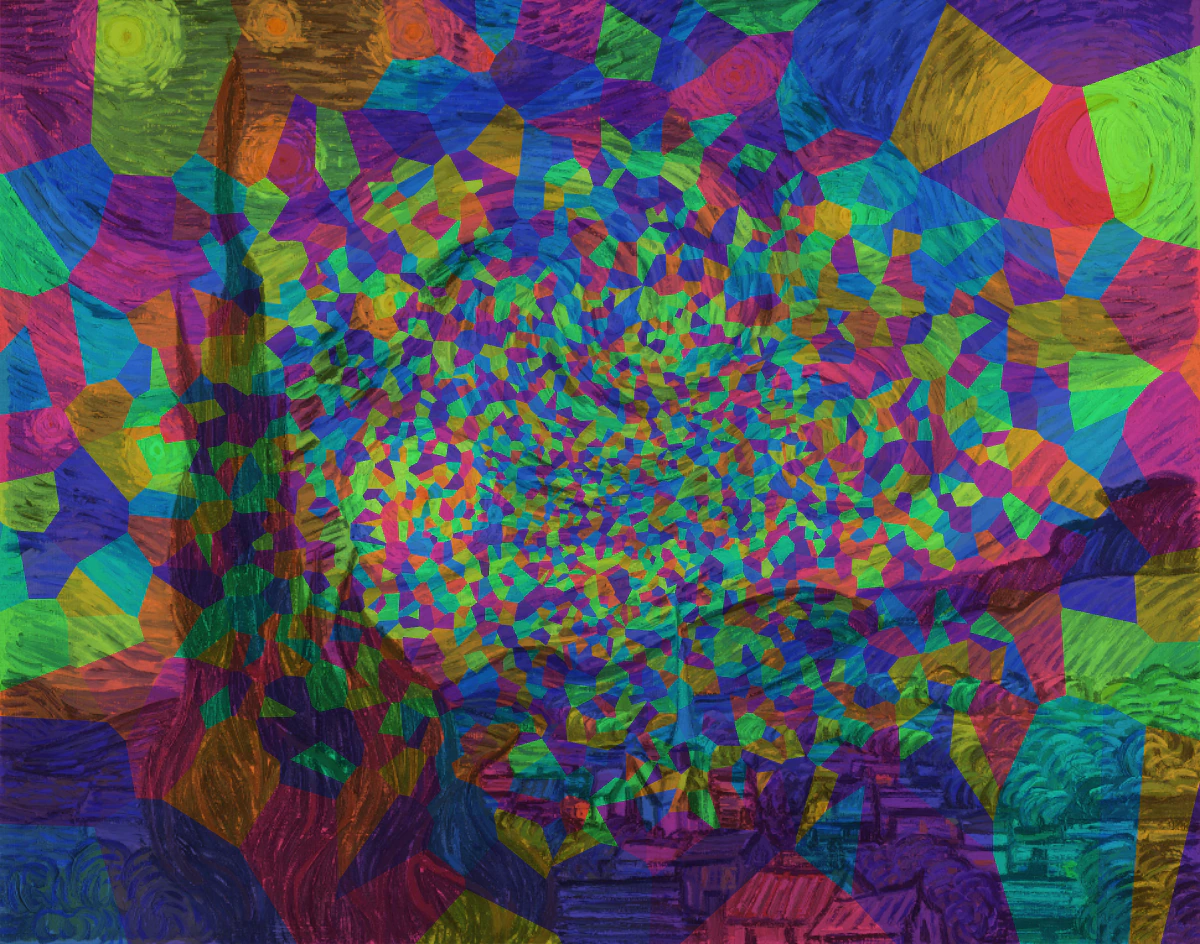 Normal Random
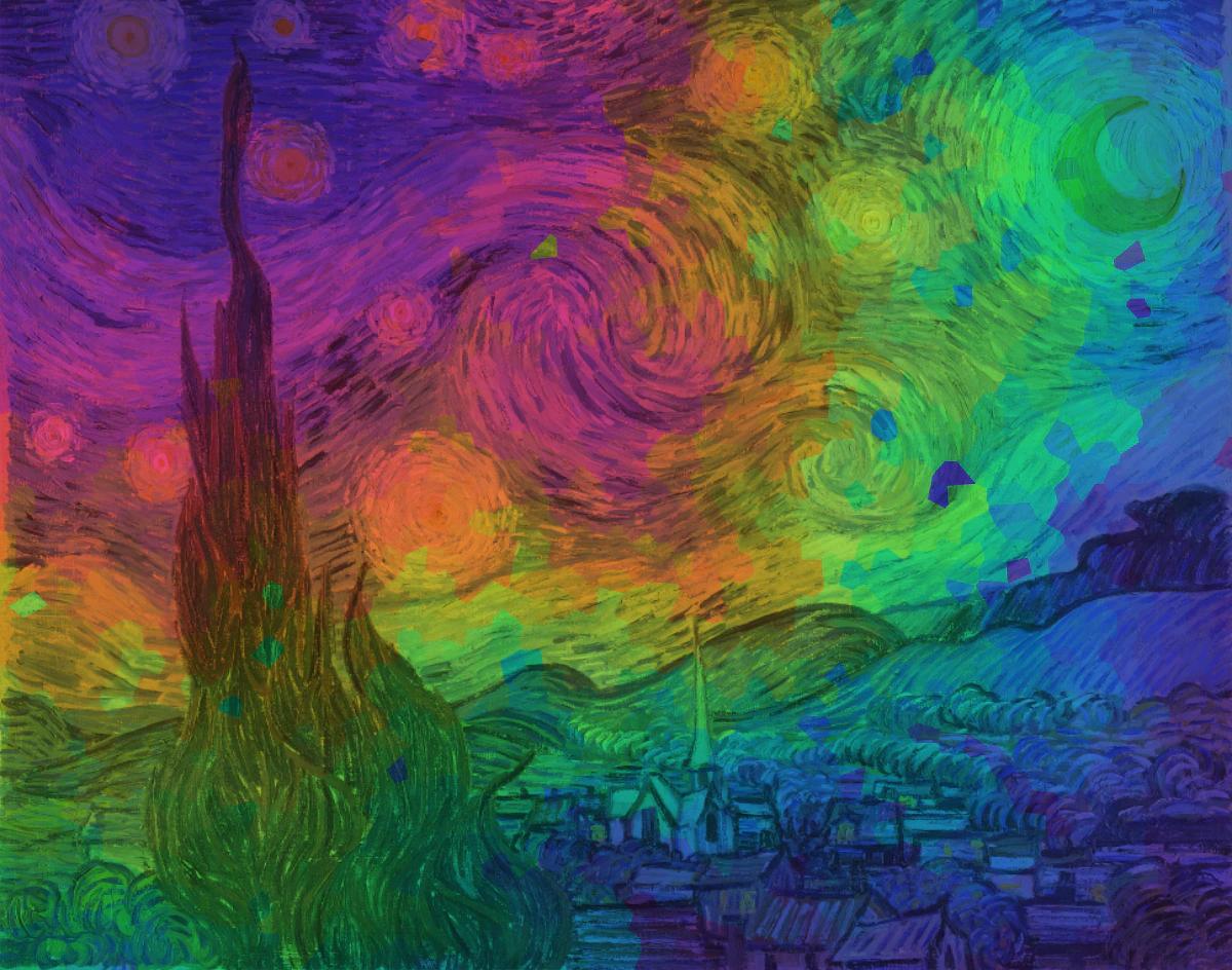 Poisson Disc Random
Searching
The next topic I explored was searching algorithms. Searching is also important, because it can be used to retrieve information stored in a particular data structure, which happens every day in our lives. The idea of the visualization is simple: randomly pick a point on the canvas and find it using the specific searching algorithm. It should color the visited area by mixing the original pixel color and the color encoded by time until the point is found.
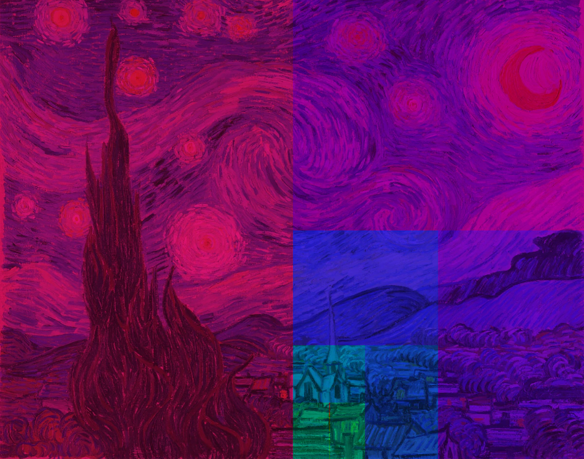
Binary Search
Binary Search is my first attempt. It's quite effective and finishes in just a few steps. The result image looks recursively divided into squares ordered by center, reminding me of Piet Mondrian's Composition with Red, Blue, and Yellow . This is binary search's key feature: it divides the search space in half each time, which results in very efficient performance.
Golden Search
Then I tried Golden Search. The difference between Golden Search and Binary Search is that Golden Search uses the golden ratio to divide the search space, making it more efficient. The result image looks like a spiral, reminding me of a snail shell.
Searching Comparison
Here is the comparison of the two searching algorithms. The result of Golden Search looks more balanced and beautiful to me.
 Binary Search
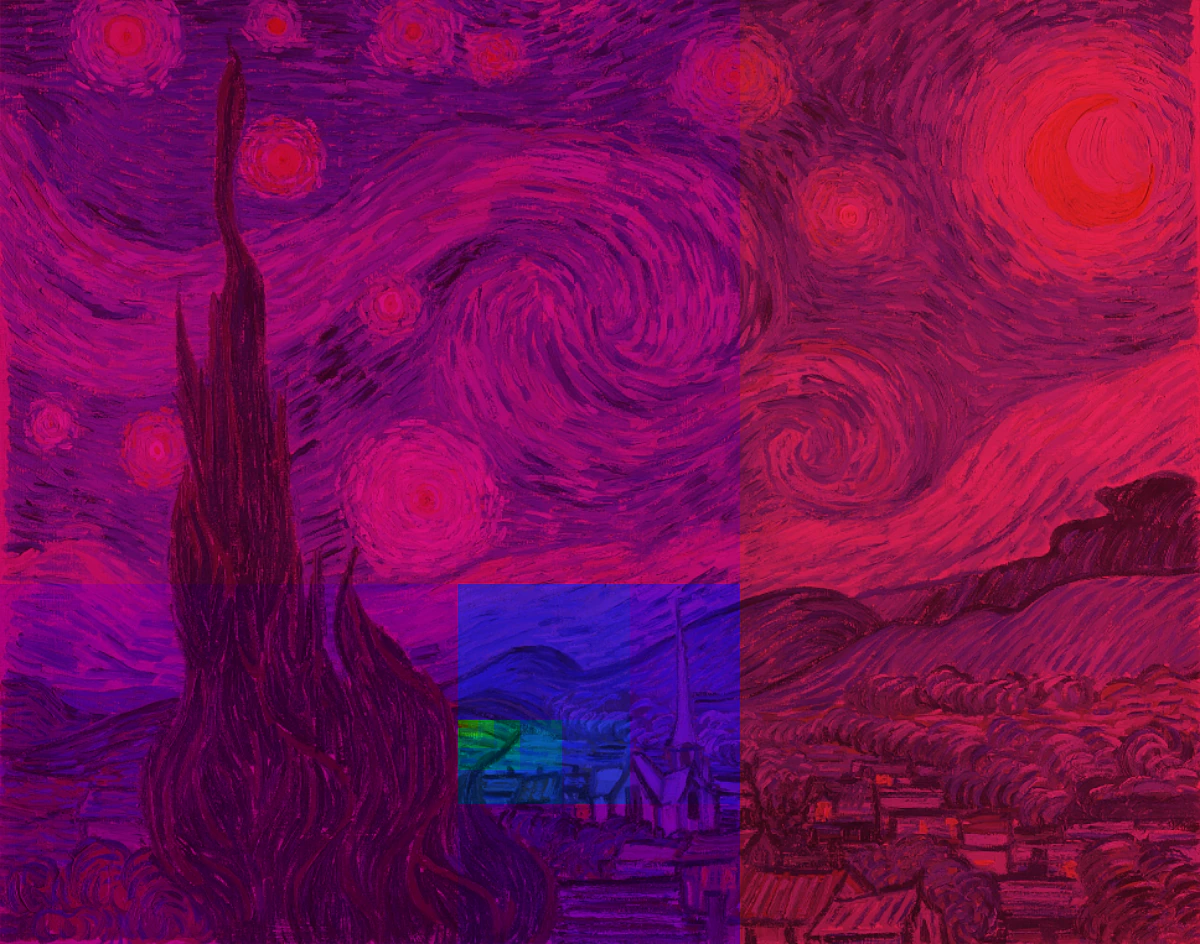 Golden Search
Sorting
Sorting is a fundamental task in computer science, and there are many algorithms for solving it. Each of them is simple, but they all demonstrate valuable algorithm design principles, so I had to visualize them! The visualization follows these steps:
- Generate a fixed number of random values.
- Sort the values and return the array at each step to get a 2D array.
- Visualize the 2D array as a matrix, where each element is a square area in the image.
- Color each square area by its value, mixed with the original pixel color.
Insertion Sort
Insertion sort was the first one I implemented. Think of it like a card game: you pick a card (key) with your right hand and insert it into the correct position in the sorted cards (sorted subarray) on your left hand. As you can see, the colors in the left triangular area of the image are always sorted, which is the key feature of insertion sort: it maintains a sorted prefix of the array at each step.
Bubble Sort
Bubble sort is different from insertion sort— it has a sorted suffix. This is because it repeatedly swaps adjacent elements if they are in the wrong order, which finds the largest element in the unsorted part of the array and moves it to the end. The colors in the right triangular area of the image are always sorted.
Selection Sort
Selection sort selects the minimum element from the unsorted part of the array and swaps it with the first element of the unsorted part. It also has a sorted prefix, so the colors in the left triangular area of the image are always sorted.
Quick Sort
The last sorting algorithm I implemented was Quick Sort, a divide-and-conquer algorithm that selects a pivot and partitions the array into two sub-arrays: one with elements less than the pivot and one with elements greater than the pivot. The key feature of Quick Sort is that it divides the array into two sub-arrays at each step, so the colors in the left and right halves are sorted simultaneously.
Sorting Comparison
Here is the comparison of the four sorting algorithms. Both insertion sort and selection sort have a sorted prefix; bubble sort has a sorted suffix; and Quick Sort has a more balanced left and right half.
 Insertion Sort
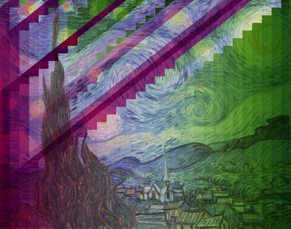 Bubble Sort
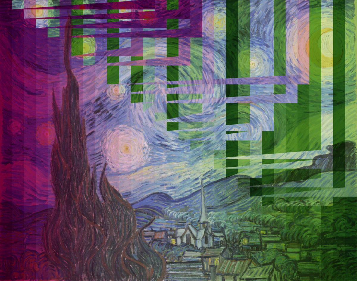 Selection Sort
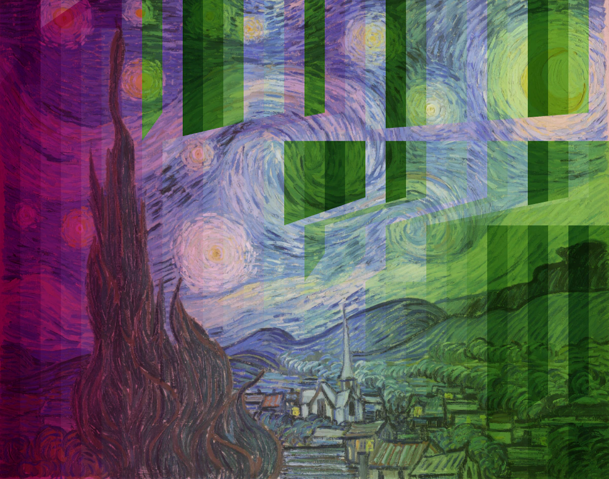 Quick Sort
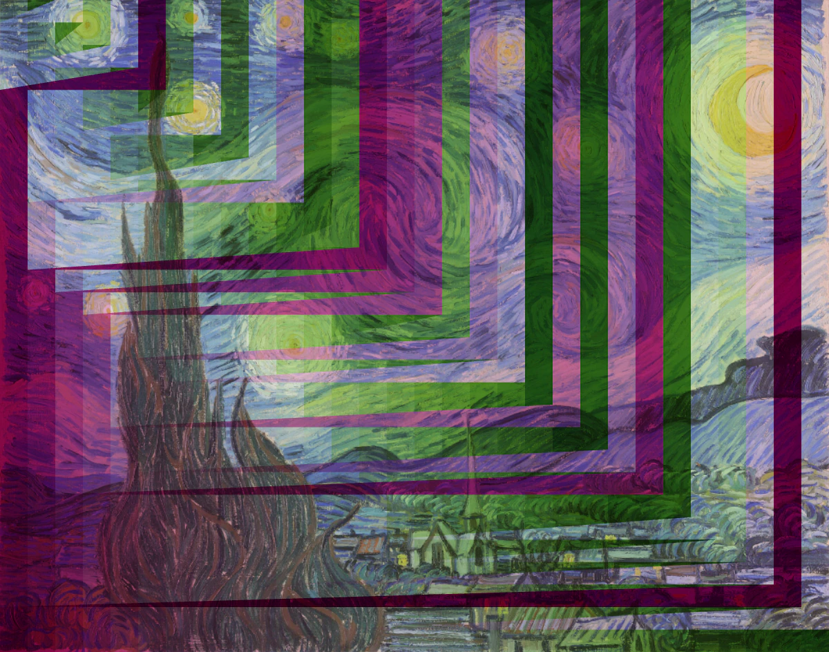
Graph
Finally, we come to my favorite part: graph algorithms! The first step is to convert an image to a graph. I used a 4-connected neighborhood system where each pixel is a node that randomly connects to its 4 neighbors with a certain probability. Graph algorithms usually involve traversing the graph, and the order of traversal is important. So I colored the pixels by the order of traversal and mixed them with the original pixel colors.
BFS
I began with BFS, a breadth-first search algorithm that starts from a source node and explores all nodes at the current depth level before moving to the next level. The result visualization looks like a wave spreading out from the source node, creating a gradient color effect.
DFS
Next was DFS, a depth-first search algorithm that starts from a source node and explores as far as possible along each branch before backtracking. The snake-like traversal pattern creates a more random and chaotic color distribution.
Prim
Finally, I implemented Prim's Algorithm, a minimum spanning tree algorithm that starts from a source node and adds the minimum weight edge at each step. The result image looks like a tree growing from the source node, with a more balanced color distribution than DFS.
Graph Comparison
Here is the comparison of the three graph algorithms. BFS applies a gradient-like effect to the image, while DFS and Prim's Algorithm create more natural and organic patterns. I prefer Prim's Algorithm the most, as the colors are more well-distributed.
 BFS
BFS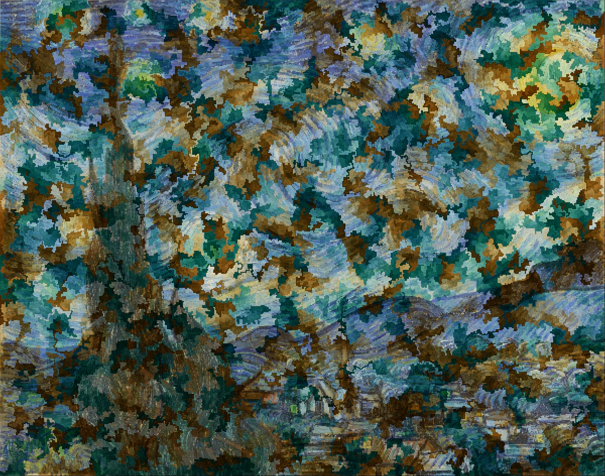 DFS
DFS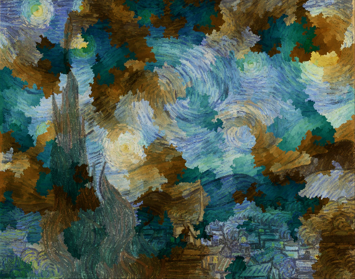 Prim
PrimPhoto Colorization
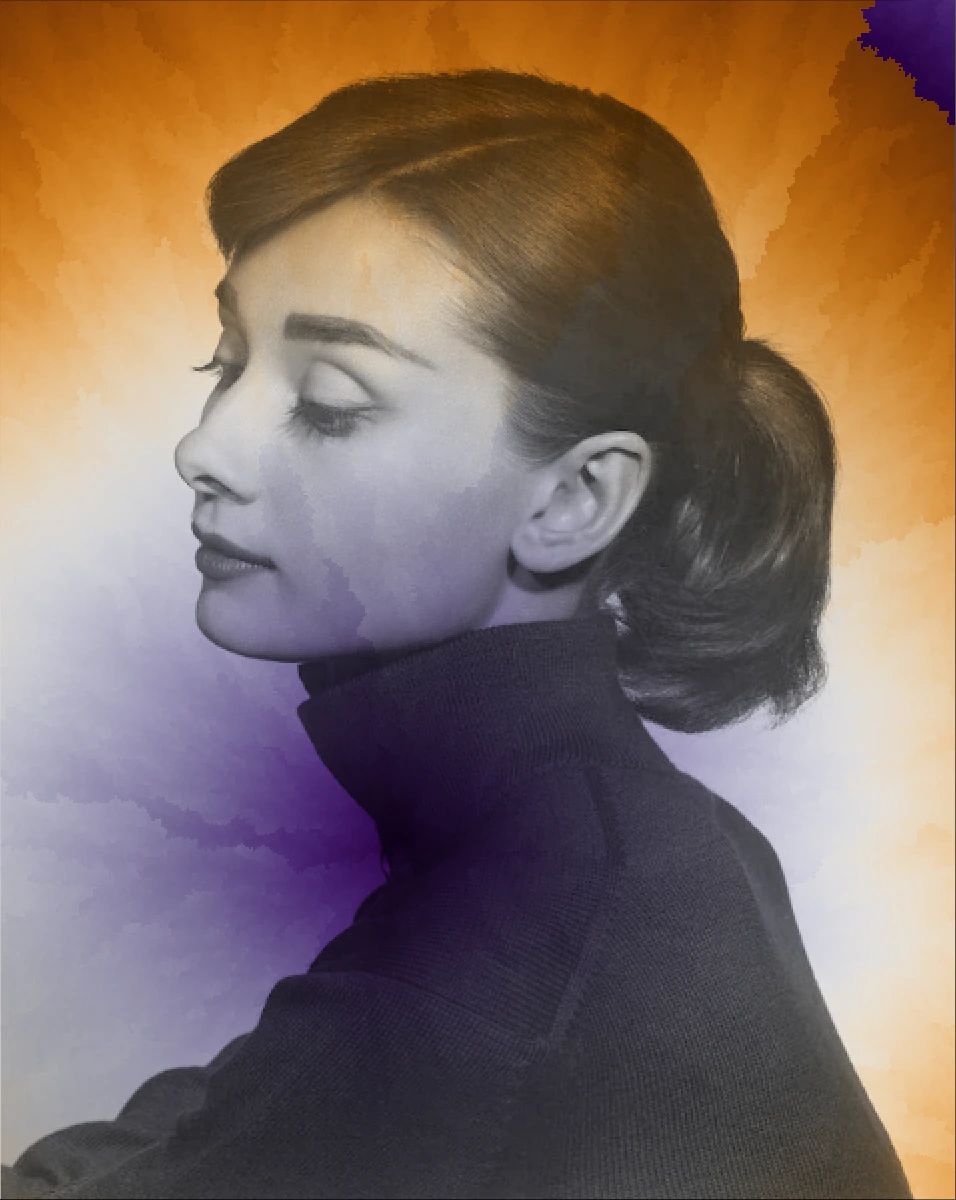
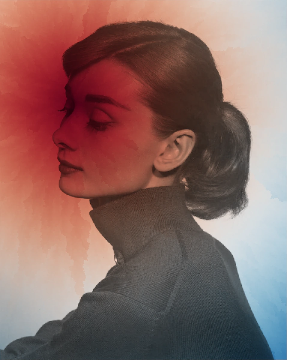
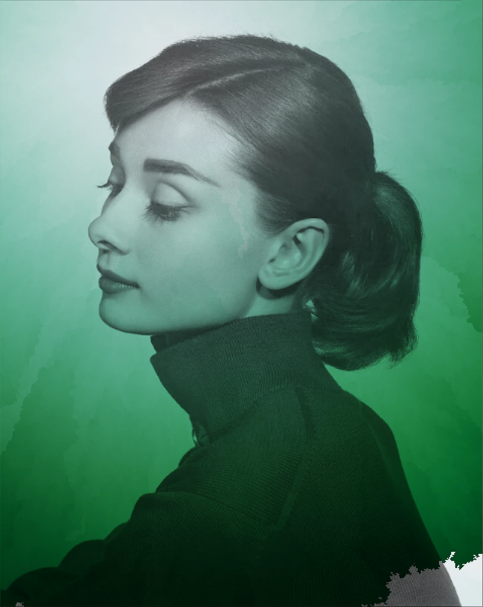
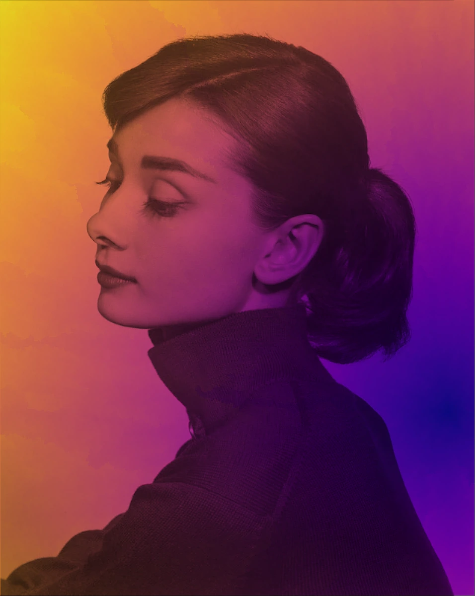
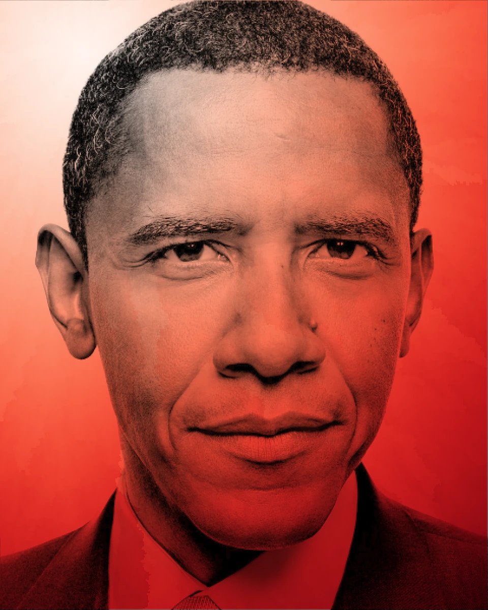
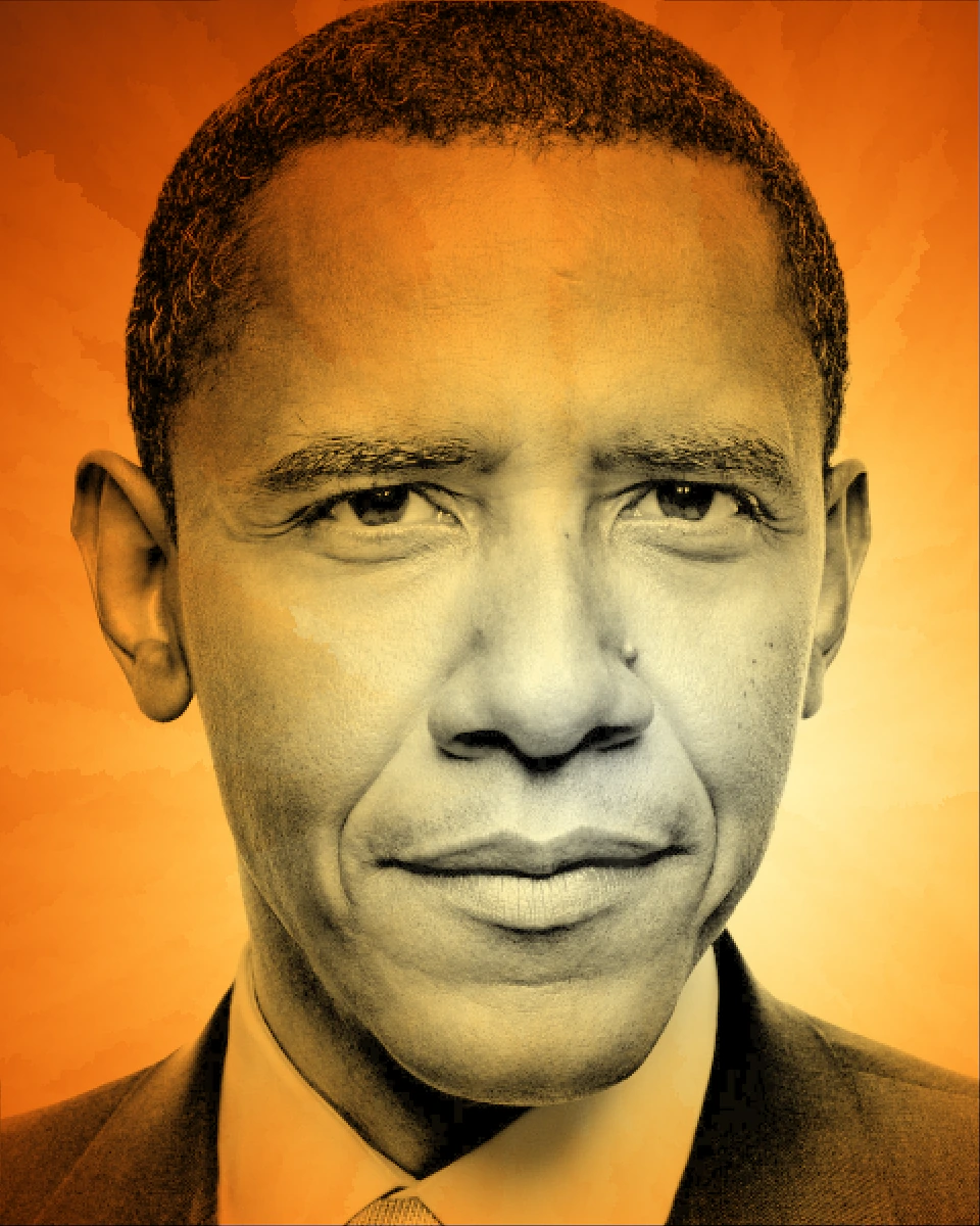
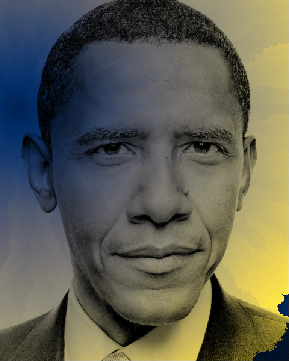
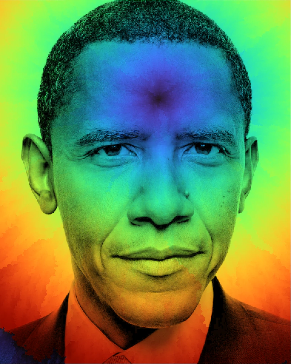
The animation of BFS visualization reminded me of the colorization process, so I thought it would be a good idea to apply it to black and white photos. Then I selected two photos of Audrey Hepburn and Barack Obama to test the colorization process.
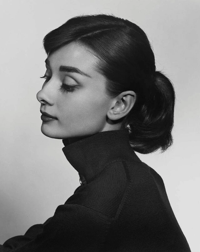 Audrey Hepburn
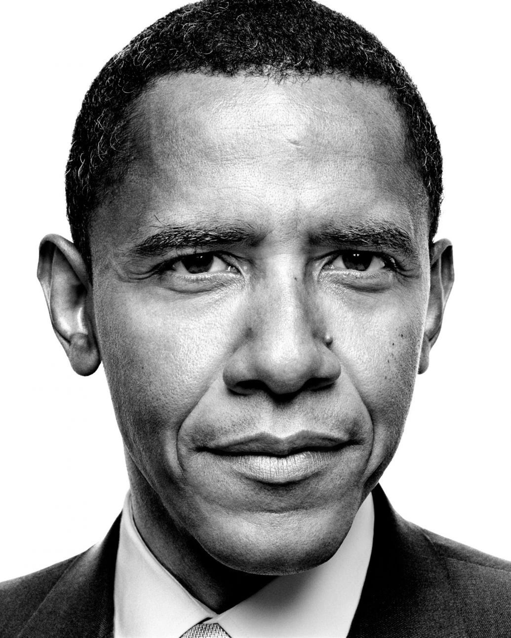 Barack Obama
Here are the results. One thing I found interesting is that it looks like shooting a spotlight on the photo, and the color is spreading out from the spotlight.
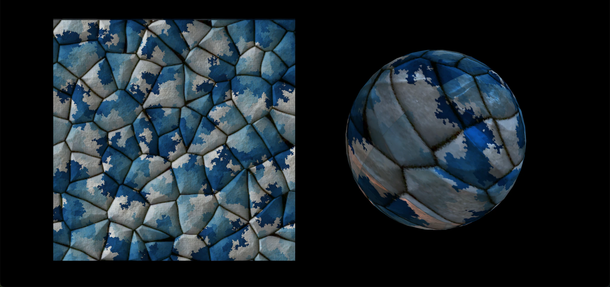
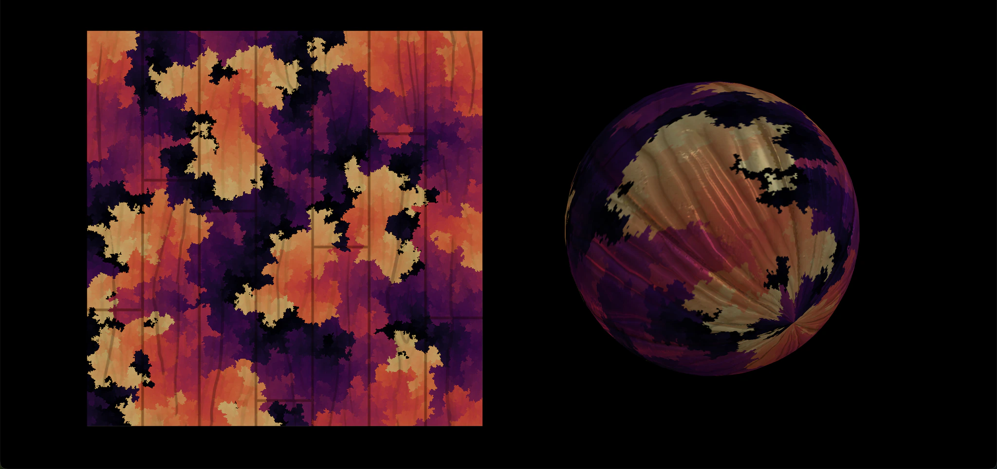
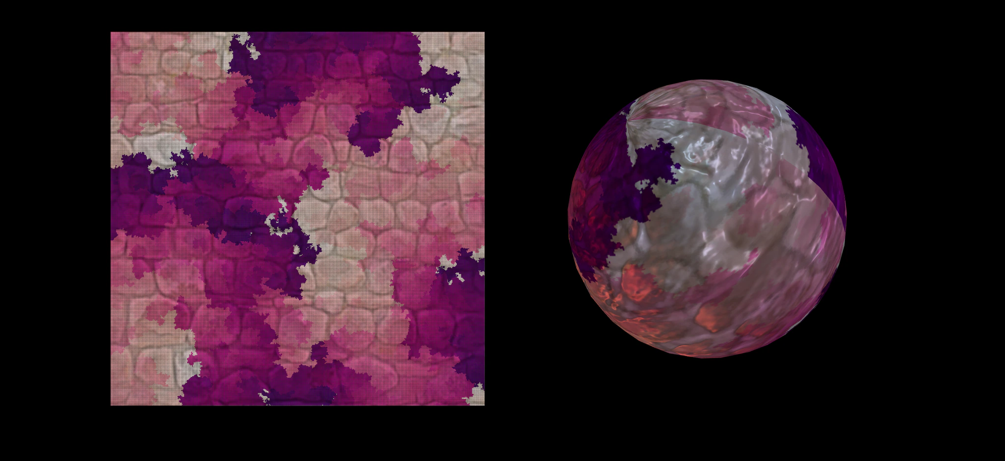
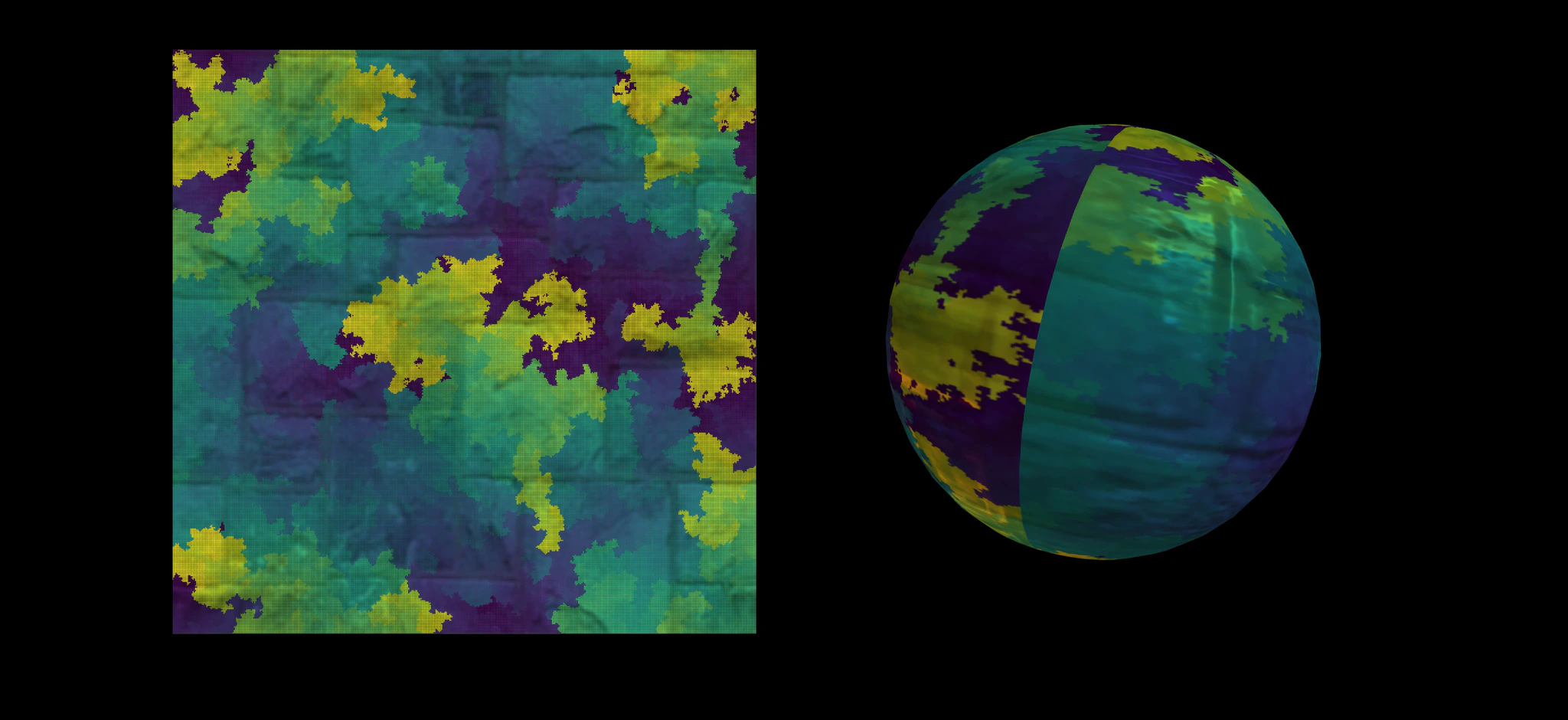
Texture Mapping
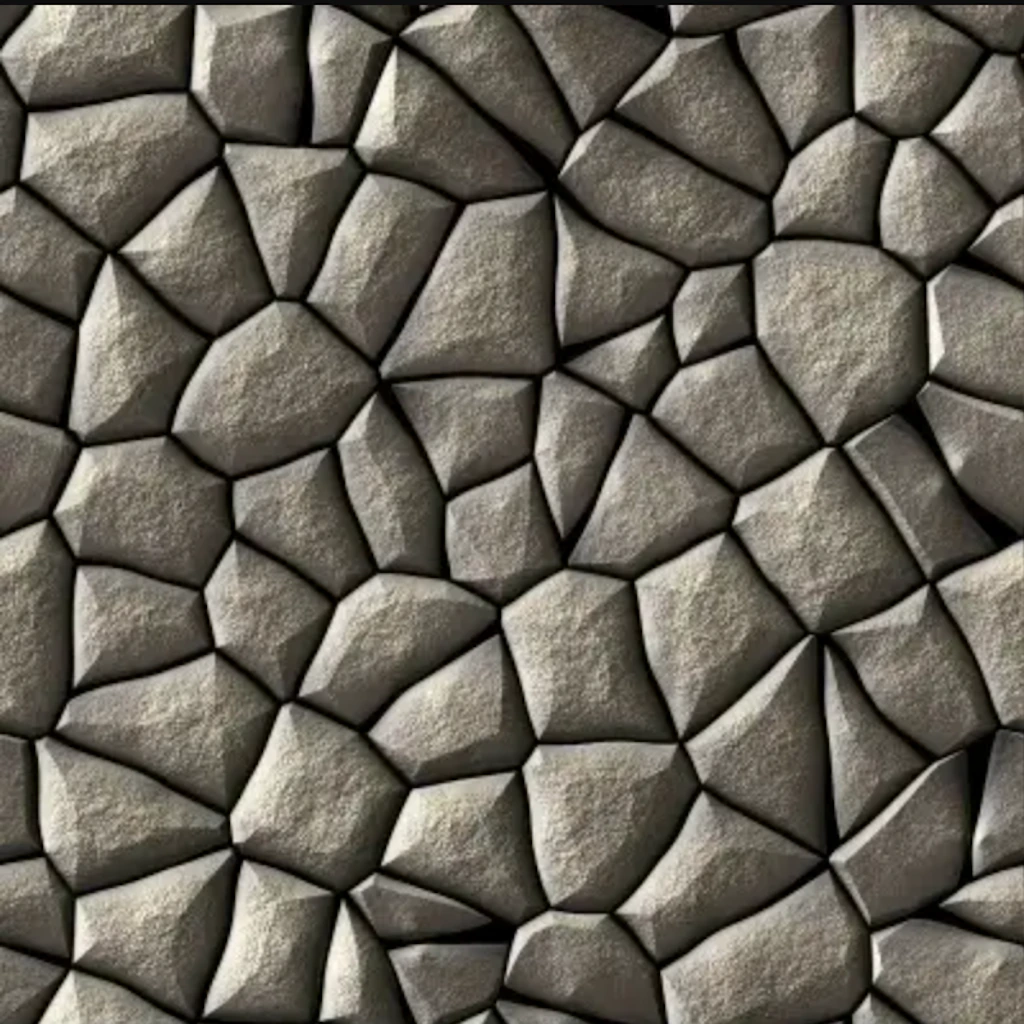
Next I tried to make the texture mapping more interesting. I selected four photos of polygons, wood, rocks, and mosaic to map them onto a sphere. This time I used Prim's Algorithm.
 Polygons
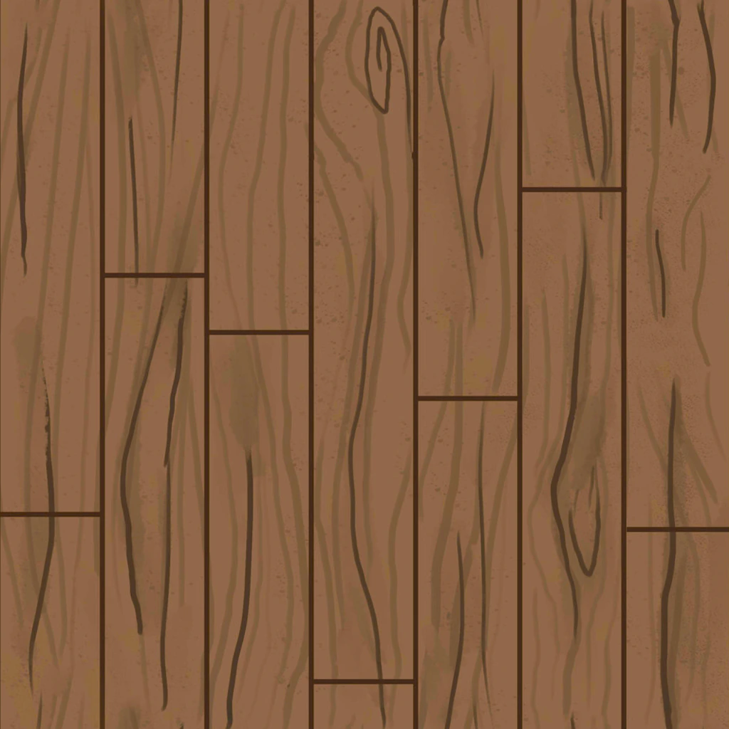 Wood
Wood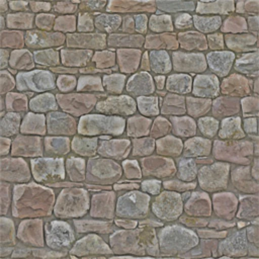 Rocks
Rocks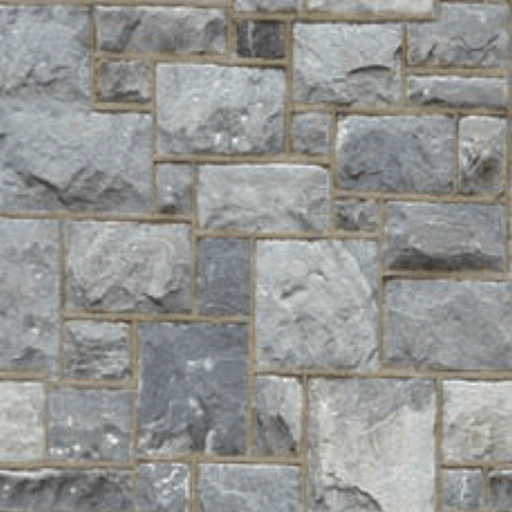 Mosaic
Here are the results. It seems that I created planets with different themes! There are a sea planet, a forest planet, a fire planet, and an ice planet! It's always fun to play with colors!
Future Work
I only implemented some basic algorithm visualizations for now. Most of them are inspired by Mike Bostock's Visualizing Algorithms. I'd love to add more algorithms and visualizations in the future. For my previous exploration on this topic, please refer to v1 and v2 branches. Let's hack, painters!
 v1
v1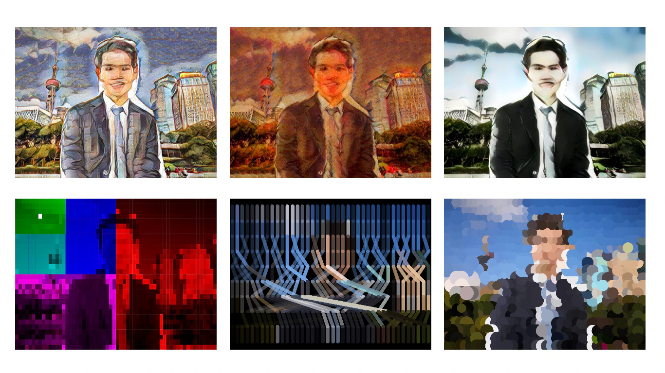 v2
v2