2019-07-10 / Bairui SU
CICSC Vis: A Visual Analysis Platform for Spatial-Temporal Data
CICSC Vis is a visual analysis platform for spatial-temporal data that we created in 2019. We used this system to solve the challenges provided by the ChinaVis 2019 Conference. Luckily, we won the national second prize for the first challenge. Let me share what we accomplished and the things I learned back then and now.
This project not only taught me about data visualization, but also shaped my path as a toolmaker.
The Challenges We Faced
Firstly, let me briefly describe the challenges we faced. CICSC (China Intelligence Cyber Security Conference) was a three-day virtual conference. For security purposes, they deployed sensors throughout the venue to track participants and record their movements. Our task was to build a visual analysis system that could help analyze this sensor data and answer specific questions about participant behavior.
The Data We Worked With
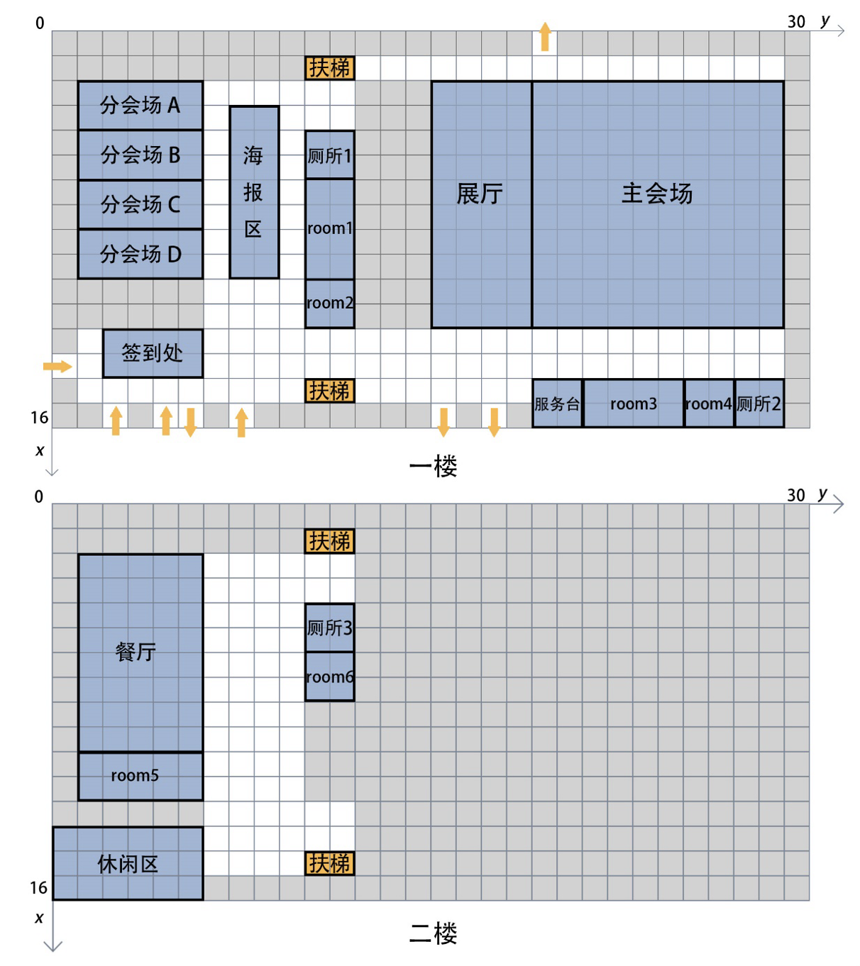
The map of the conference is shown in the following figure.
The sensor distribution data follows this format:
- sid - sensor id
- floor - floor number
- x - x coordinate
- y - y coordinate
We received three CSV files containing sensor log data, one for each day of the conference. The data format was as follows:
- id - person id
- sid - sensor id (sid)
- time - time in seconds start from 00:00:00
For example, this data entry shows that person 17647 was detected by sensor 012 at 09:00:00, stayed for 100 seconds, and then moved to sensor 013 at 09:00:01.
17647, 012, 32400
17647, 013, 32500
Key Questions to Answer
Based on the map and sensor data, we needed to answer the following questions:
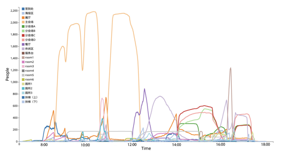
- Infer the schedule arrangements of the main venue and each sub-venue during the conference.
- Please analyze the types of participants in the venues during the conference and summarize the movement patterns of each type.
- Please identify at least five notable abnormal events that occurred during the conference.
- In your opinion, what were the shortcomings of this conference in terms of organization and management.
How We Approached the Problem
The biggest challenge was the sheer volume of log data—1,879,488 rows, approximately 32MB uncompressed. We needed to develop a strategy for filtering the data to explore specific details while maintaining the overall context to avoid losing the big picture. Additionally, we had to figure out how to define venues and participant types based on the data dimensions. If we succeeded, we hoped to identify unexpected patterns and provide meaningful insights.
Our Solution Design
After several brainstorming sessions, we decided to divide our system into two complementary parts:
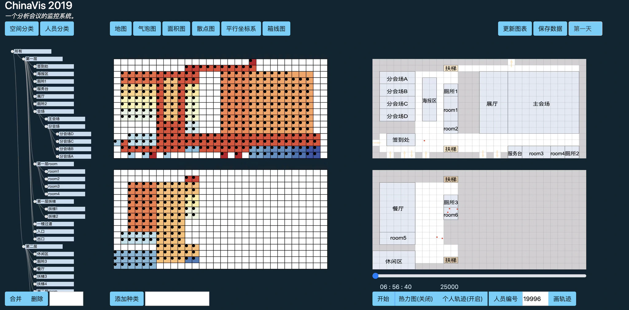
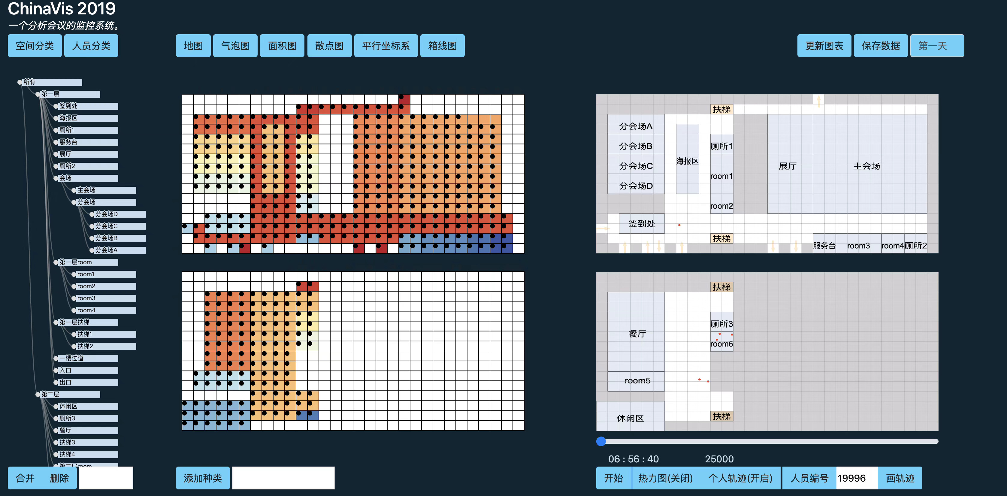
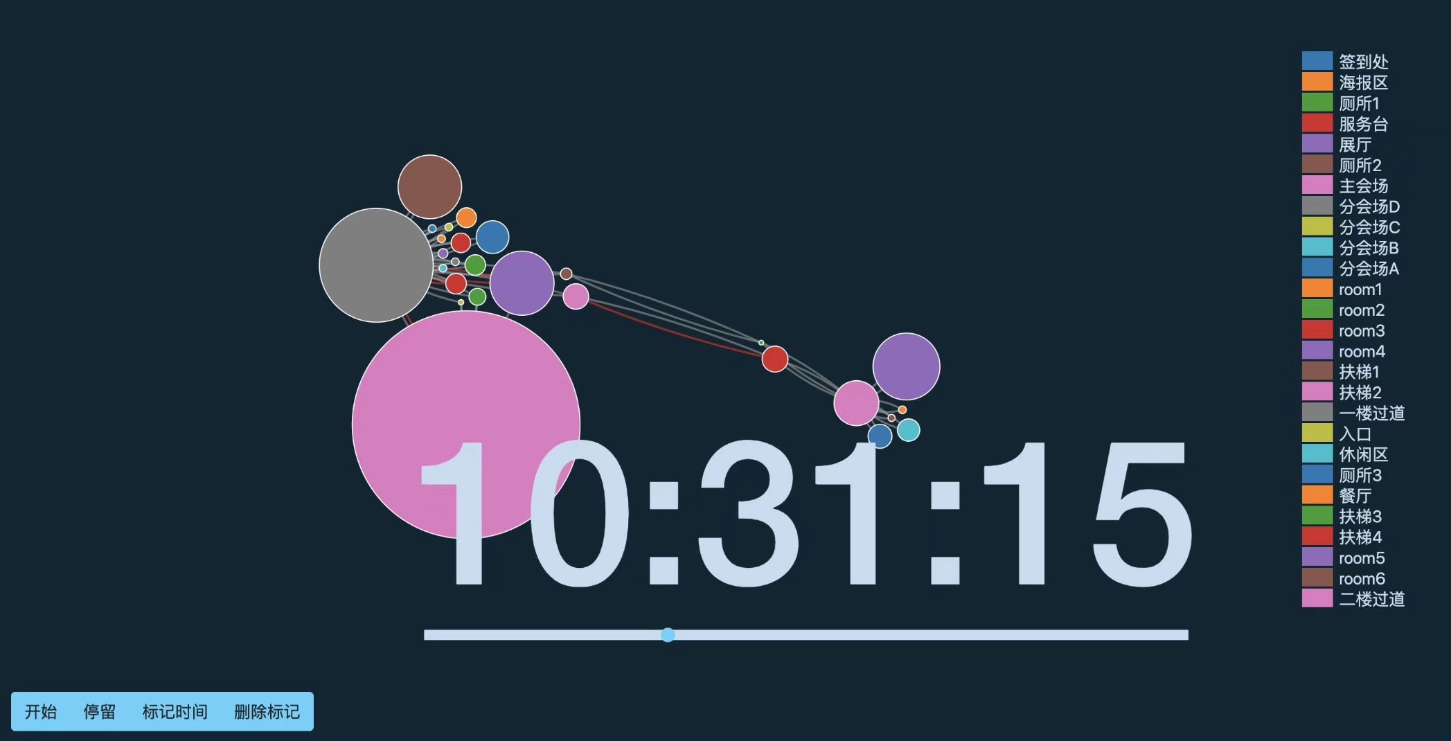
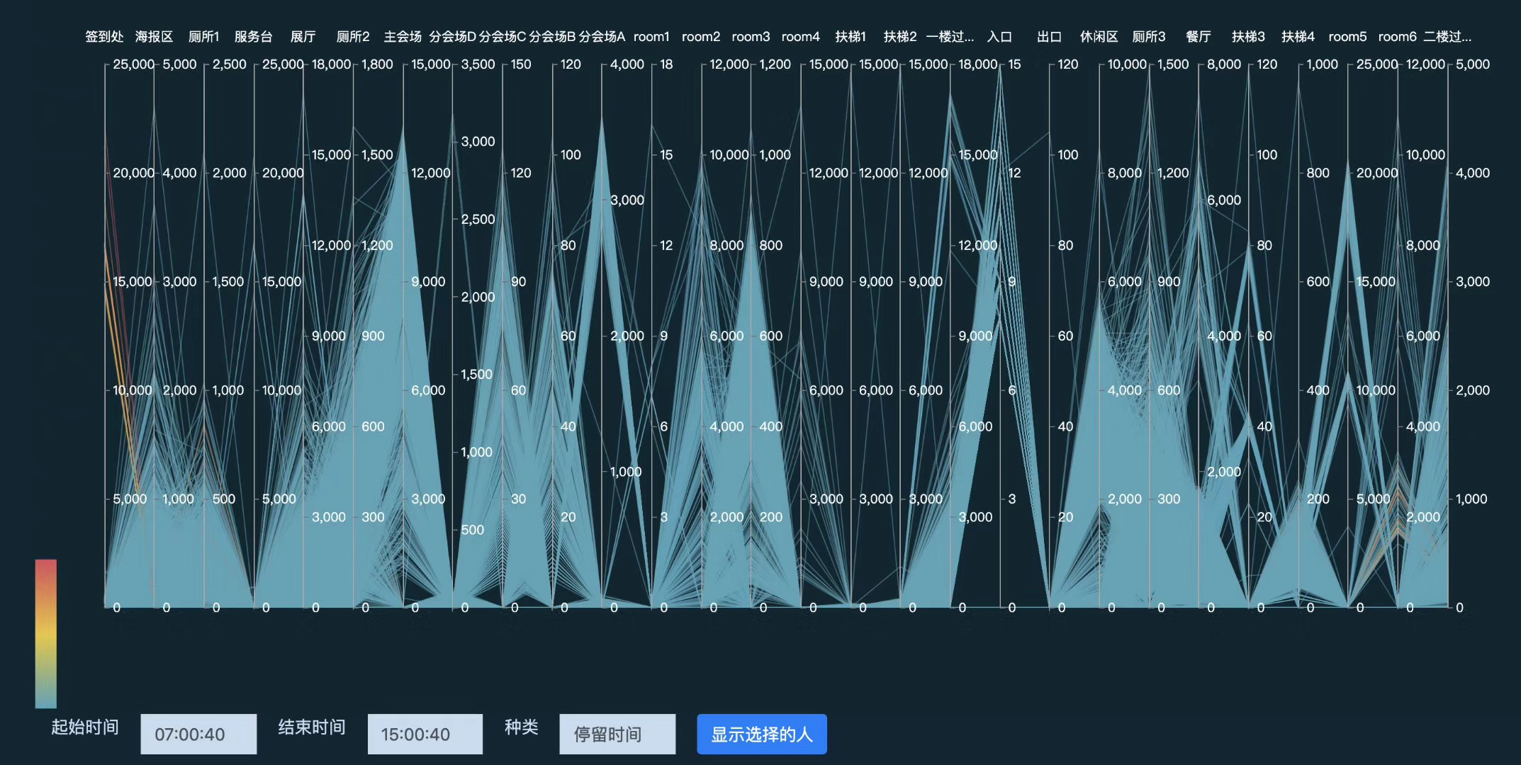
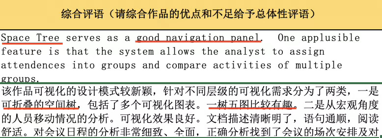
- One tree with 5 charts (the left part) - We designed a space tree to filter data by spatial dimensions, complemented by interactive inputs and sliders for temporal filtering. We employed bubble charts, area/line charts, scatter plots, parallel coordinates, and boxplots to visualize different data features. When combined, these visualizations provided a macroscopic perspective for data exploration.
- Real-time simulation system (the right part) - When we identified interesting patterns worth exploring further, we used the real-time simulation system to visualize the data in much greater detail.
Venues
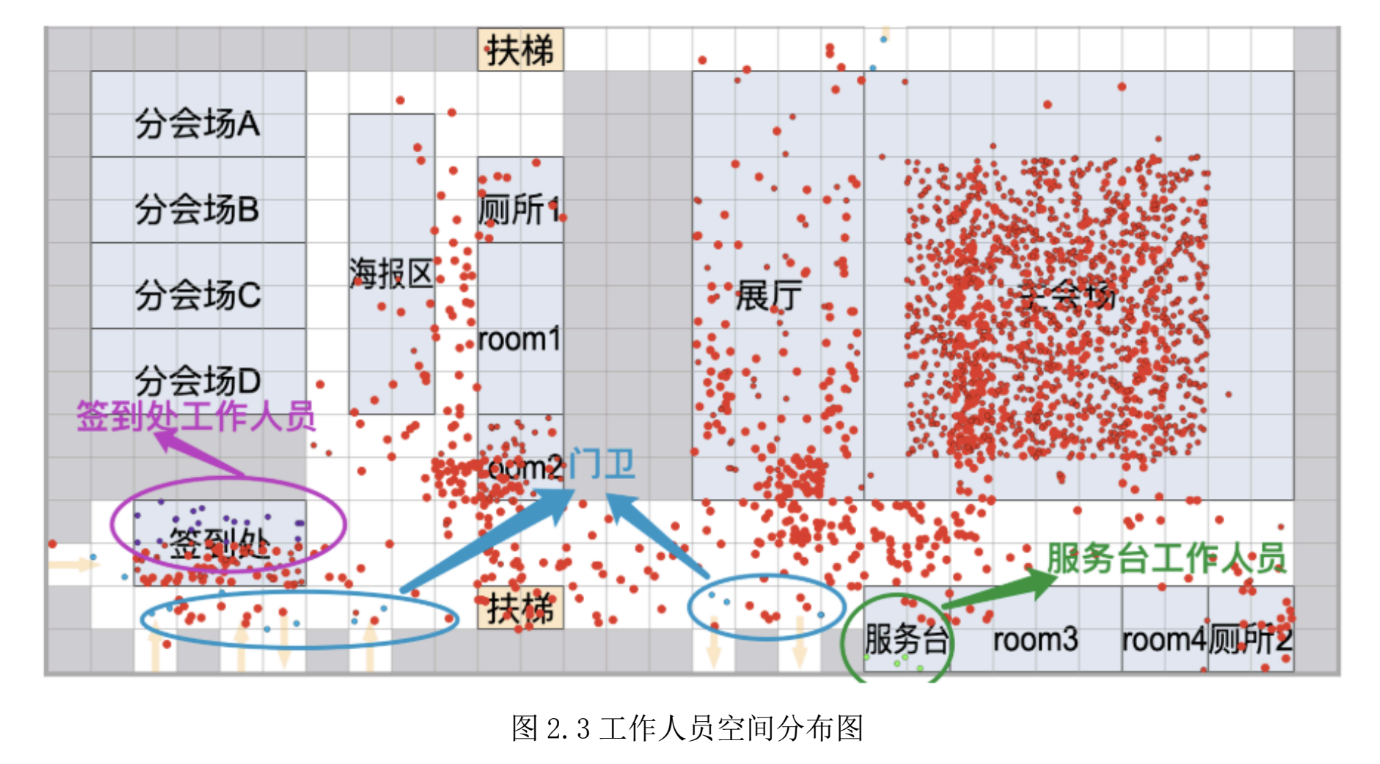
For venue analysis, we made a key assumption: venues can be identified by changes in the number of people in specific areas over time. To test this hypothesis, we used line charts and dynamic bubble charts to identify temporal patterns.
Participants
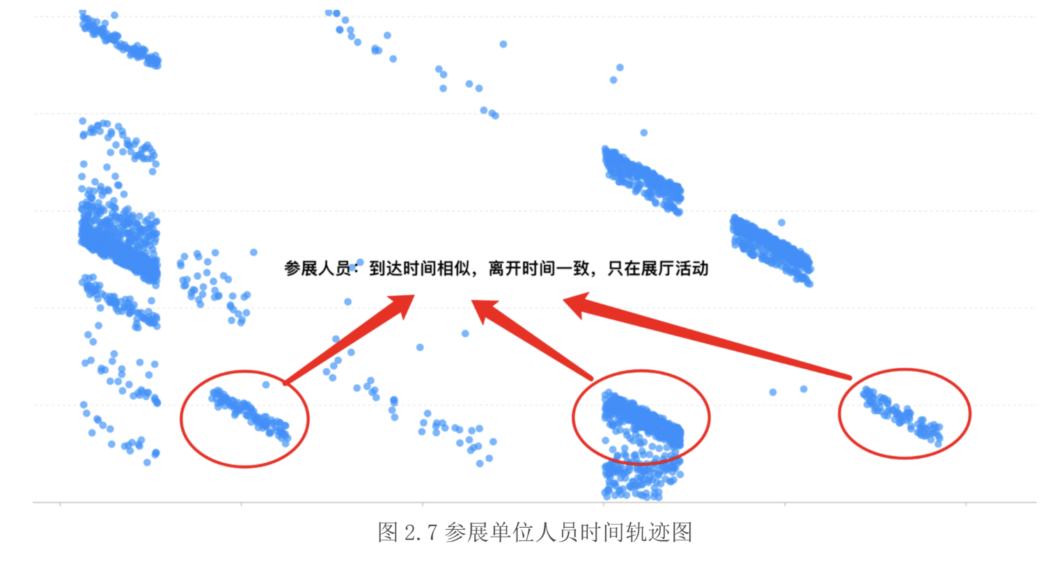
Similarly, we hypothesized that participants of the same type would exhibit similar movement patterns—such as arrival/departure times and duration of stay. To explore this, we used scatter plots and parallel coordinates to visualize and compare movement patterns across different participant categories.
Validations
We then used the real-time simulation system to tag and filter the data, validating our initial assumptions. The system even allowed us to trace individual participants' movements, revealing unexpected behavioral patterns.
That was the core concept behind our system. This was the core idea behind our system.
For more detailed information, please refer to our paper and analysis report.
How I Presented Our Work
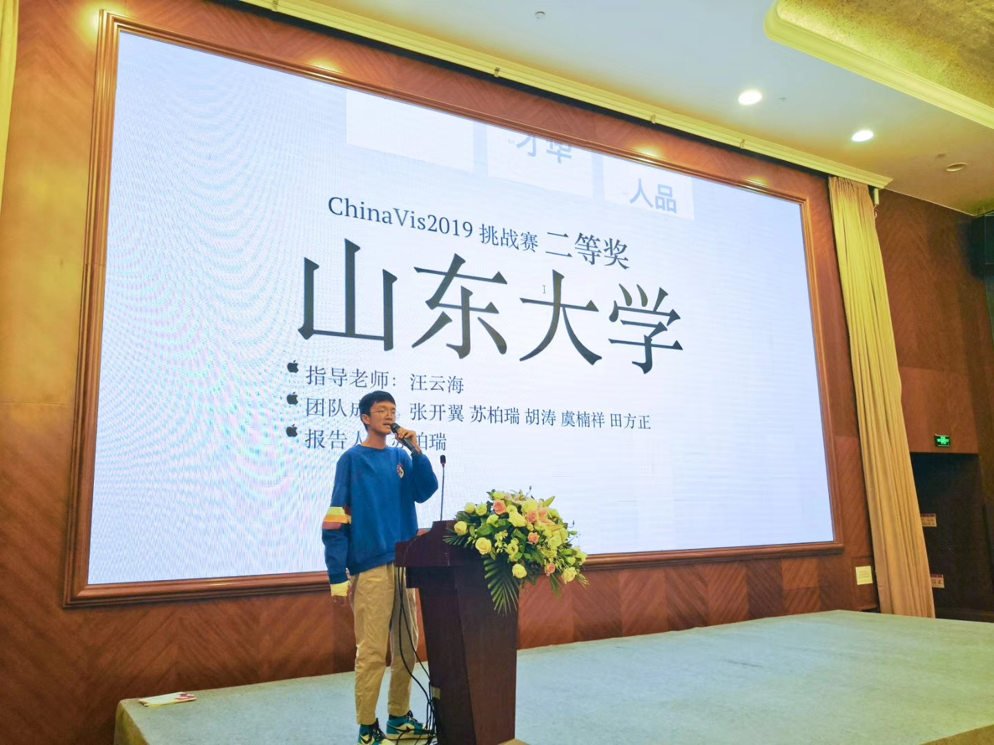
I'm grateful that my teammates trusted me to deliver the presentation.
I opened with an interesting quote: "affection for someone begins with appearance, is deepened by talent, and endures through character." I then demonstrated how our system excelled in interface design (appearance), analytical methodology (talent), and robust implementation (character)! While the analogy wasn't perfect, the audience responded well, especially to the impressive visual effects created with impress.js.
You might have noticed that I had a cast on one of my hands. That's because I broke my hand in a basketball game. I ended up coding almost entirely with one hand. What a crazy experience!
What I Learned Back Then
I was pretty satisfied with the result back then, and most importantly I learned something from this experience.
Good collaboration means well-defined responsibilities. I handled the first part of the system implementation and component integration, while Kaiyi excelled at the second part. Nanxiang Yu and Tianfang Zheng's dedication to answering the competition questions using our system was invaluable. The final submission we created together was incredibly detailed and comprehensive. Clear tasks allowed each of us to fully focus on our own duties and made it easier to "merge" our work together.
Building tools with code is magical. It was my first time to create a software tool. When the system was running and other people were using it to solve problems, I felt like I was the "God" for this tiny world. I created something based on my imagination from nothing and I was able to do any changes I wanted. This largely ignited my passion for becoming a digital toolmaker. It also motivated me to participate in more data visualization competitions (nCovis Challenge, VAST Challenge).
High-level data visualization tools have limitations. I found that existing high-level tools like Vega-Lite, ECharts, and AntV G2 had limitations—I couldn't find one that could implement all the features I wanted. For example, interactions were not easy to implement in Vega-Lite, the visual style was old-school in ECharts, and AntV G2 didn't support parallel coordinates. These inconveniences eventually led me to join the AntV team and contribute to G2 5.0.
Building user interfaces with vanilla JavaScript is challenging. I struggled to build the user interface without any framework. It was challenging to create dynamic components and manage state effectively. This experience convinced me to learn React afterward.
Impress.js is impressive but can be improved. When I used impress.js to create the slides, I spent considerable time positioning each slide manually through code. To streamline this process, I developed Gossip half a year later, which unexpectedly sparked my passion for open source development.
Looking Back from 2025
Looking back at this project from 2025, I can see many areas where we could improve both the implementation and design. Also, I have new perspectives on some of the things I learned back then.
Listening to the users is crucial for tool development. After reviewing the answers at the time, I found that my teammates barely used the system I implemented. They just used some simple charts to answer the questions. This issue happened a lot in my previous projects. I always focus more on what I like and ignore the users' feedback. It is good if you just want to have fun, but if you want to build a tool that is useful for others, you really need to listen to them.
Sometimes, UI frameworks are still too much for data apps. UI frameworks are good at building general-purpose applications. They don't provide extra help for visual data analysis workflows. For now, I may choose Observable Framework to build the whole dashboard. Their Markdown-based reactive system is perfect for interactive data exploration. Not to mention the built-in support for D3 and Observable Plot and the revolutionary data loaders!
Good tools are highly extensible and composable. I used to want to build tools that cover everything. This was what I was trying to do with designing the 5.0 version of G2, which was largely due to the limitations I met when building this project. After being reported a lot of issues and being asked to add more features, I started to think: is it a good idea to aim at covering everything for users? What if we just focused on the core features and let users extend the abilities through well-designed APIs? Or made it easy to work with other tools to achieve the same goal? This is why I think D3 is the best tool I've ever used.
I need to revive Gossip! Gossip still has quite a few users nowadays. However, I ignore the users' feedback and it hasn't been maintained for a long time. Let's not ignore the elephant in the room. It should be fun to revive it with AI!
I never thought this project could bring me so much joy and inspiration. It even changed my growth path to some extent. Like what it says, life is like a box of chocolates—you never know what you're gonna get.
Further Reading
Here are some resources where you can find more details about this project.
- Video demo of how the system works
- Paper for the design and implementation
- Analysis for the answers
- Source code for real-time simulation system
Special Thanks
I'm grateful to all my wonderful teammates and my professor for their support and guidance throughout this project.
- Kaiyi Zhang
- Nanxiang Yu
- Tianfang Zheng
- Yunhai Wang